Brand guidelines
RG Syndicate
We pool our talent to execute work too large, and too important, for any one team alone.
Plus Ultra. Further beyond.
The mark
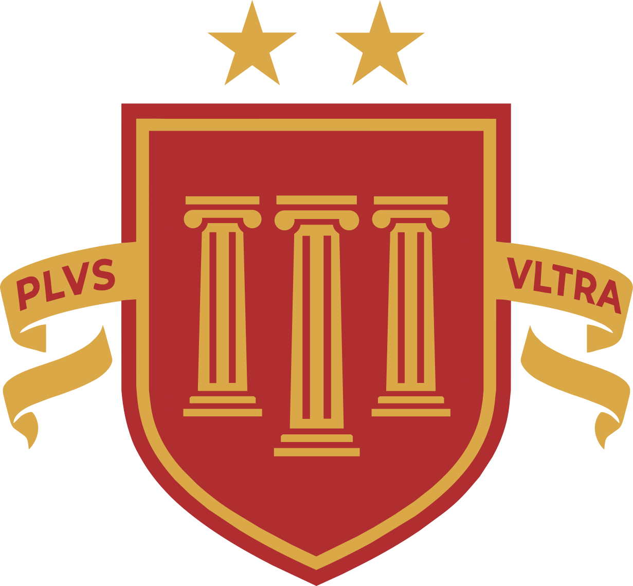
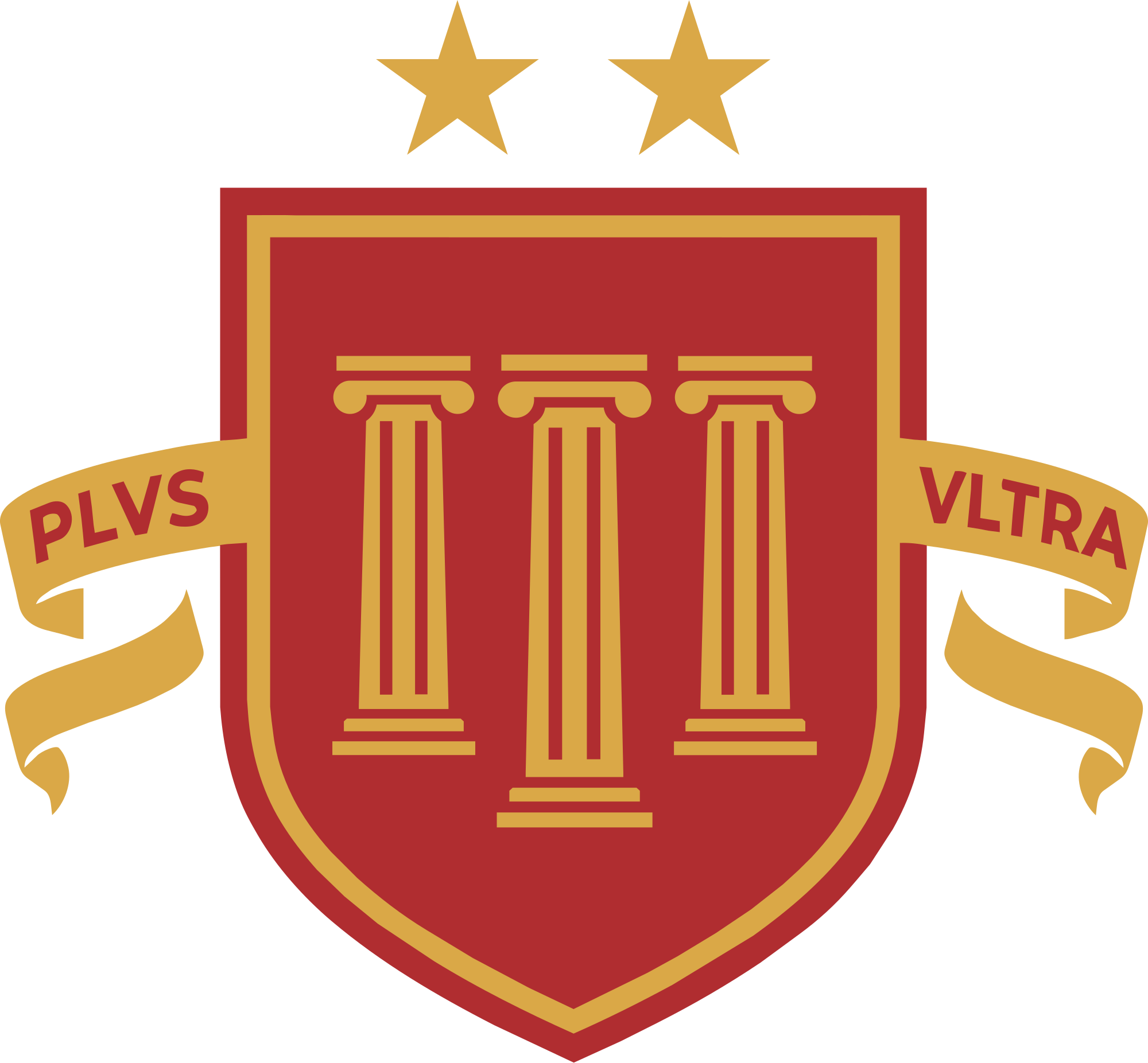
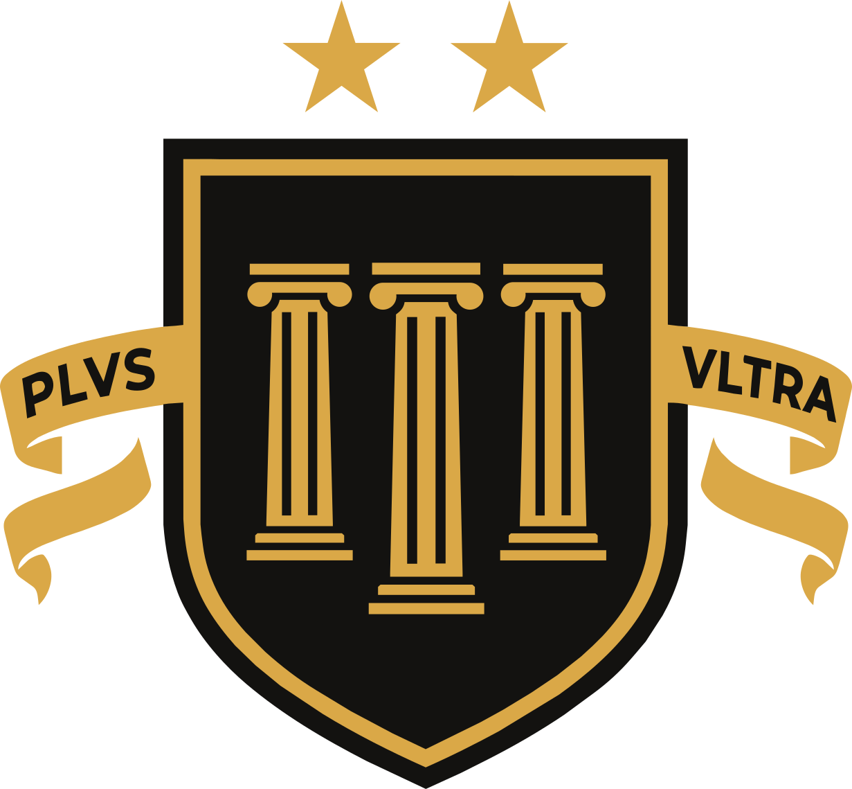
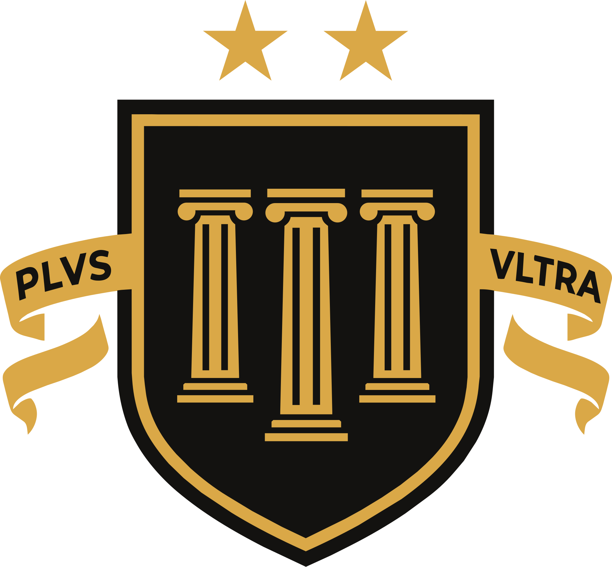
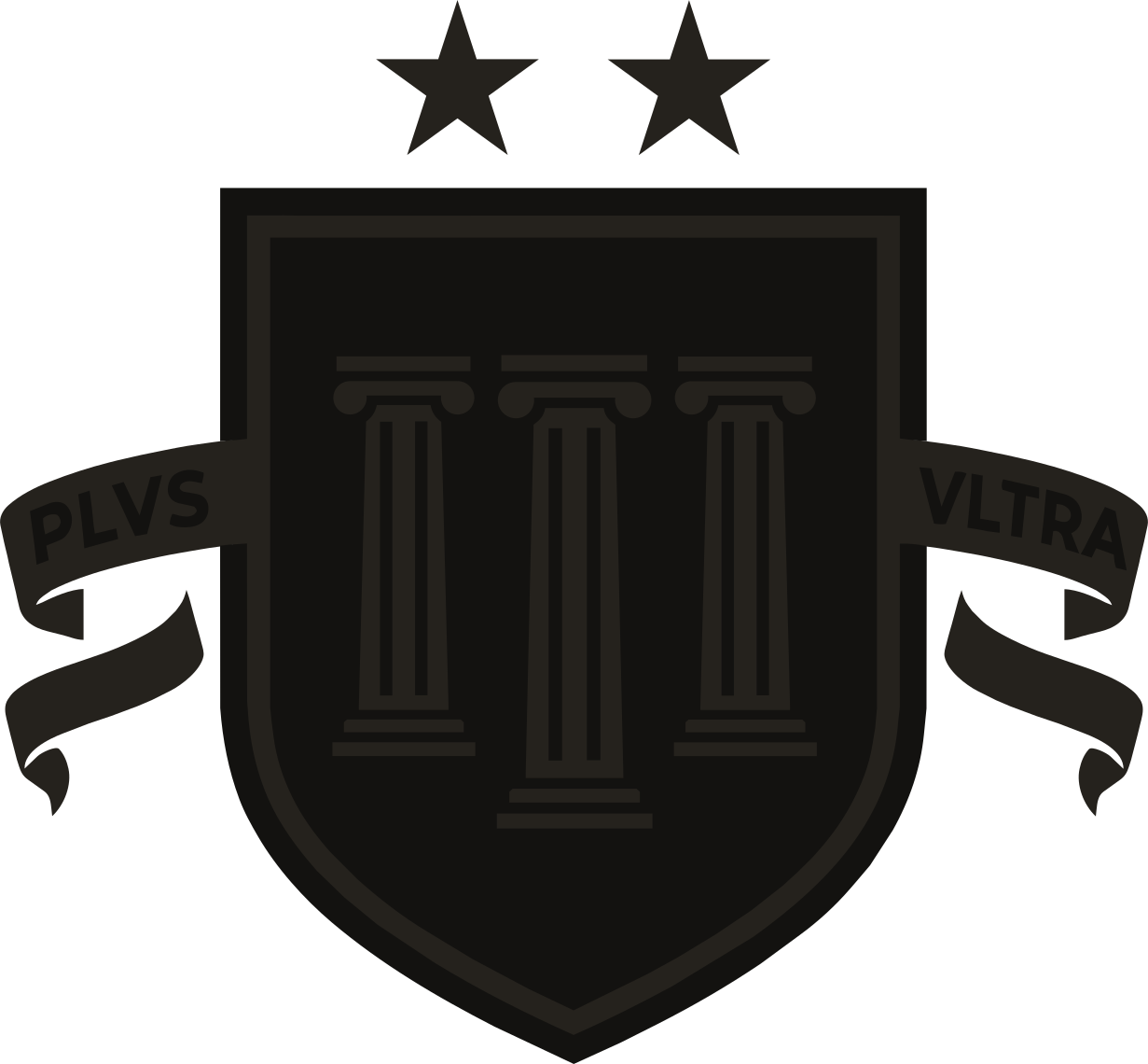
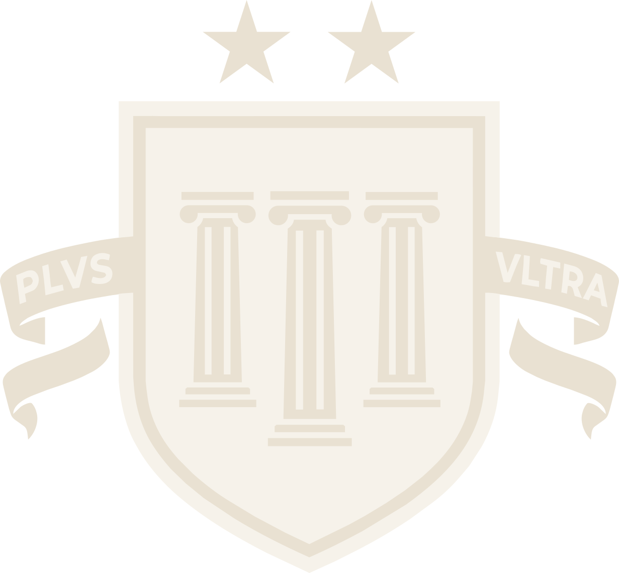
The crest is a portico. Three equal columns carry one standard, framed by the motto that gives the syndicate its thesis.
Plus Ultra
Latin for further beyond. Spain struck it on the pillars to reject the old warning that nothing lay past the edge. It is the whole reason the syndicate exists. Set as PLVS VLTRA wherever it is part of the design, written Plus Ultra in a sentence.
The stars
Two marks of excellence, one for each of Spain's World Cup wins, that the alliance holds itself to on every mandate.
The heritage
Drawn from the Spanish coat of arms, a nod to the syndicate's roots and to its first work abroad.
The pillars
The mark stands on pillars, a nod to the Pillars of Hercules that carry the Plus Ultra motto. They also stand for how we work: scope, schedule, and budget, held in balance. The mark is the promise, and the promise is the balance.
Logo versions
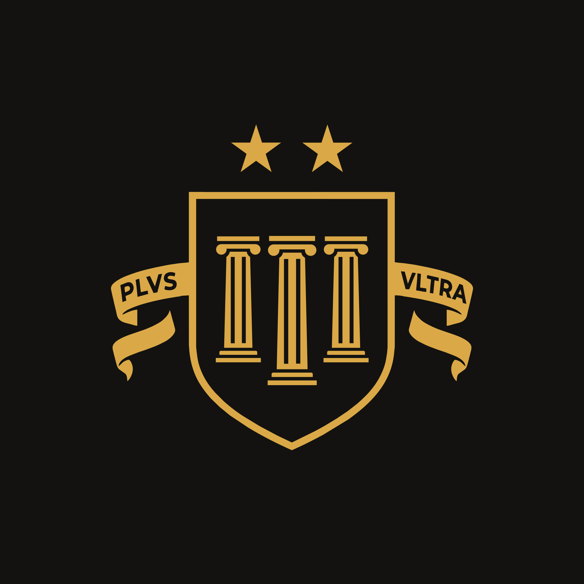
Two color builds cover every surface. The red mark leads on light. The black build carries both light and dark, reversing to a gold line when the field drops out.
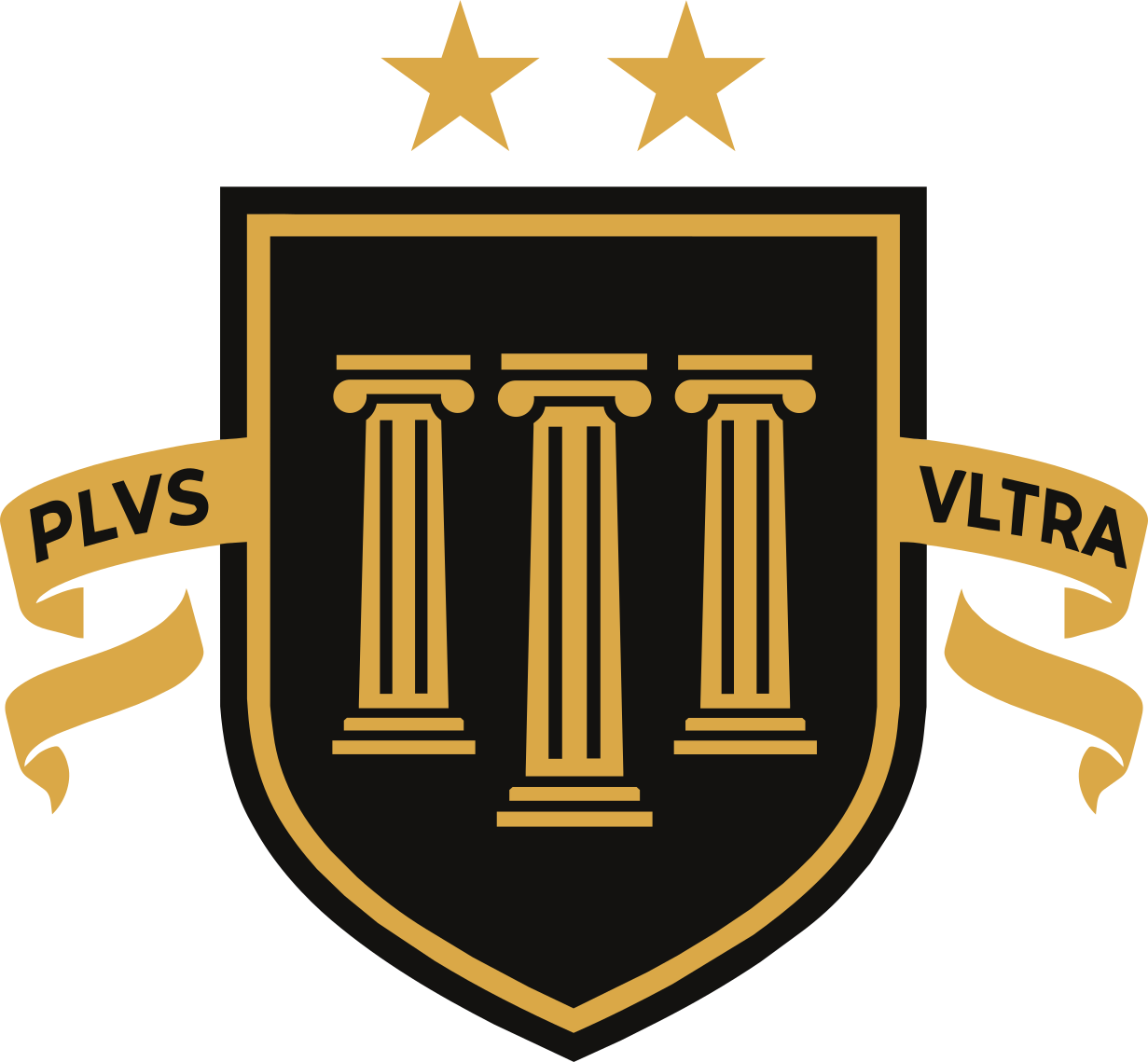
A single-color foil version, with the columns knocked out of the shield, gets derived from this geometry for embossing and stamping.
Clear space & size
Give the crest room and never crowd it. Each star sets the unit of breathing space, and the banner sets the floor for how small it can go.
Below the minimum the banner text closes up. Use the shield and columns alone at the smallest sizes.
Misuse
The mark holds its authority only when it stays exactly as drawn. Do not do any of the following.
Color
Three brand colors do the work, held on bone with a single muted neutral. Restraint is the rule. Rarely more than red, gold, and ink in one composition.
Patterns
Five textures, all drawn from the crest. Each sits one tone off its ground, so it reads up close and disappears from across the room. The tiles download as SVG for slides, print, and the web.



◆ One texture per surface: a pattern or the crest, never both.
◆ Always one tone off the ground. A pattern is felt, not read.
◆ Keep it out from behind small text that has to work hard. Give it a band, a panel, or the empty side of a layout.
◆ The star never repeats in a pattern. It marks one thing, once.
Typography
Archivo commands, Inter explains, the mono keeps the ledger, and Cinzel speaks only the motto. Four voices, each kept to its lane.
Voice
RG\u00A0Syndicate speaks as a collective, never a single name. The register of a side that came to win.
Confident and plainspoken. The syndicate pools its talent and holds one standard, and it says only what it can execute. No hype, no filler, no overselling. The work speaks, so the words do not have to strain.
Words we use
Words we avoid
The three pillars
The crest carries three columns. The work carries three pillars: scope, schedule, and budget.
Scope
Define the work and the deliverables with precision, so nothing drifts and nothing balloons.
Schedule
Build a timeline that is realistic, then protect it. Pace is a feature, not an afterthought.
Budget
Secure the resources the work actually requires, and spend them with intent.